Hidden Structure – A Beauty Editorial
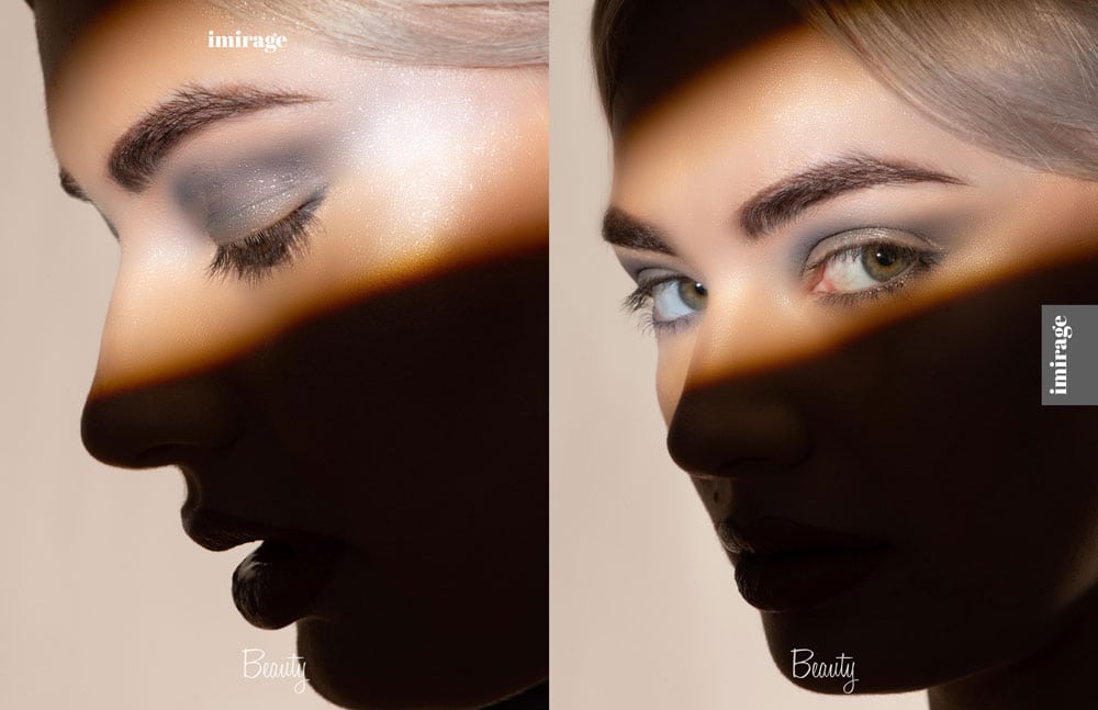
No matter where in the world you are, images connect us to some of the most powerful stories. This weekly magazine, Imirage , looks for out of the box, vivid, creative, colorful, edgy beauty and high-end fashion photography. With that in mind, I decided to create this series of images – Hidden Structure – a beauty editorial.
Typically I used either natural light or a beauty dish for beauty headshots. This time I decided to use the optical snoot. I wanted to highlight only parts of the face and allow the shadows to create mystery. This reminded me of my painting and sketching days. Artist, like myself, love shapes and shadows, the more the merrier.
Light is meant to sculpt your subjects, not flatten them out. In the past I used two square soft boxes and ratio the tension by bringing on box further back and the other closer to my subject. Today I used one light, vflats, sometimes background lights, and either kicker lights and/or a hair light. It all depends on the subject, the story, and the look and feel I’m aiming for. However the one light as the main creates that one catch light in the eyes. Think about it, there’s only one sun and one moon. It looks so unnatural to have two catch lights in the eyes. Also the shadows on the face create a three dimensional feel and at times diminish any unwanted features; ie a double chin for instance.
Like I mentioned in other post like this one, I went by my real name not my business name ArtChick®. For whatever reason it maybe, going by your real name for fashion works! To see more work like this visit my fashion website: https://KristineDiGrigoli.com.
If you would like a copy: Issue: # 814 is available – magcloud.com/browse/issue/1919156

